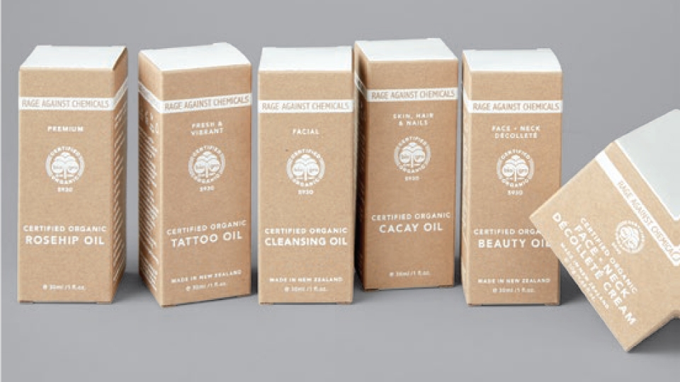
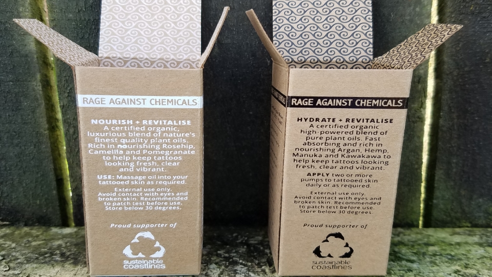
To reinforce the organic nature of the product, Rage Against Chemicals chose a Kraftpak stock—and then developed a simple, yet striking one colour palette for each range—black for men, white for the women.
The end result has a distinct shelf presence, and communicates the values of the brand and product. It provides an earthy and natural look and feel to match their International Award Winning, Certified Organic Skincare. Other than using a renewal cardboard outer, their range comes in glass jars and bottles too!
CREATIVE: Hollow Design
PRINT: Logick Print
CLIENT: Rage Against Chemicals
PROJECT: Skincare Packaging
STOCK: BJ Ball Kraftpak Kraft
PRINT SPEC: Black + white foil / black + white ink


